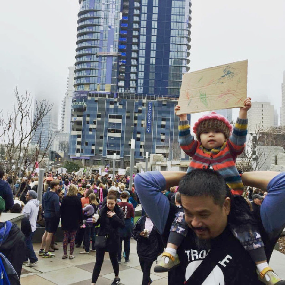
Several times during the first 100 days of Donald Trump’s presidency, hundreds of thousands of people took to the streets, many of them for the first time. Starting with the Women’s March on Washington the day following President Trump’s inauguration, individual citizens made their voices heard with a decidedly analogue vehicle: the DIY protest sign.
In an age where the tweet reigns supreme, it may seem odd that marker and cardboard are the tools of the resistance. But there are marked similarities between these two message platforms: brevity, wit, and authenticity. With either 140-characters, or a couple of words sketched on poster board, the messages conveyed have to be instantly intelligible and memorable, just like any good slogan. Cleverness, use of humor or puns, and shocking or strong language can all be used to drive a point home. Both platforms also are intensely personal; social media profiles are proxies for one’s place in the world, and the sign held at a march is a way to make a personal sentiment known in a sea of people eager to say something. They aren’t made by a machine; they are made by a person with specific feelings who wants that opinion to be heard.
While professionally designed and illustrated posters were mass produced and handed out to protesters at the Women’s March on Washington, the most evocative and effective messages were scrawled out on poster board with markers or cheap paint –the medium of ordinary citizens. Shepard Fairley’s “We the People” series was free to download and print, and was made available in The Washington Post as a full page advertisement. But the bulk of the signage in people’s hands were crude DIY messages made with no design knowledge with drug-store bought supplies. While they weren’t created at a conference table full of marketing staff, but many of these protest signs adhered to the same conventions of good design, whether they meant to or not. First, the messages were readable, especially from a distance. The layouts were balanced, and words arranged in a hierarchy. Words were emphasized using color or size. The combination of type and symbol or image forms a more complete message. Sign making parties were collaborative, with community critique and creative brainstorming. They were clever and witty, using popular memes, references to culture and media, and snappy slogans.
But, perhaps most importantly, they allowed each person walking the pavement an outlet to say why she was present. Authenticity in message is the most valuable tool in protest design. After all, typography may not even be necessary when the message comes from the heart: